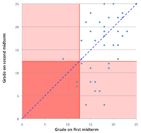
Here's a graph comparing how each student in my pilot genetics course did on the first and second mini-midterms. The first tested their understanding of the relationship between genotype and phenotype, especially in diploid organisms. The second tested their understanding of how alleles are inherited through meiosis and mating. The material on the two tests did not overlap at all. Both were 25-minute, open book, and mostly multiple choice and short answer.
The blue dashed line separates students who did better on the first midterm (dots above the line) from students who did better on the second (dots below the line). Although many students did worse on the second one, 14 of the 38 did better.
The two dots in the lower left square are students who failed both tests. The single dot in the upper-left pink square is the student who failed the first test but passed the second. The ten dots in the lower-right pink square are students who all passed the first midterm but failed the second (some very badly).
We've just entered the marks for each question, but I'm starting to think that the dataset is too small to allow any more useful generalizations.

No comments:
Post a Comment